Primary lockup
 Able
AblePotato
probably has a plan.
Write the name as Able Potato. Keep the words selectable, with comfortable space around the complete lockup.
Able Potato
Brand guide / v6
Meet Able Potato. A capable, curious character behind tools that help people find an idea, test a hunch, and take the next step.
Meet the identityOur new identity, shared across a curious family of tools.
01 / Identity
A friendly face, a clear name, and just enough mischief to make the work feel possible.
Primary lockup
Ableprobably has a plan.
Write the name as Able Potato. Keep the words selectable, with comfortable space around the complete lockup.
The supplied profile art is the primary character. Its relaxed expression makes confidence feel approachable. Keep the shape, face, cape, and colors exactly as supplied.
The character can welcome, orient, and celebrate. Give instructions and important information their own text. At small sizes, pair the profile image with the name.
The thumbs-up variant is a supporting pose for welcome and completion moments. Use one character illustration at a time, with enough room for the work around it.


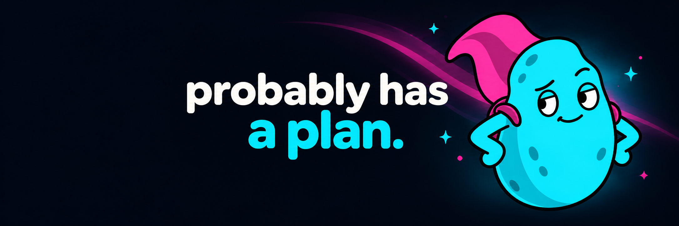
The supplied X banner keeps the original line, probably has a plan. The accompanying profile is @AnAblePotato.
02 / Color & type
The familiar cyan and magenta stay. Softer shapes and a rounded display face make the interface feel more human.
#050812The canvas.
#0d111fQuiet working surfaces.
#26caeeStructure and action.
#d043a1Atmosphere and Bloom.
#ffffffWords that matter.
These are the interface colors. The supplied illustrations keep their original colors. Use white or cyan for essential text on panels; keep magenta in decorative light. Check contrast against the actual surface.
Nunito Sans / 700 · 800 · 900
A plan
starts here.
Bold, rounded, and easy to recognize. Use for the wordmark, short headings, and product names.
System sans / body & interface
Start with a hunch.
Find out what holds up.
Use familiar letterforms for reading, forms, navigation, and data. Body text starts at 16px.
Monospace / small, useful details
SOURCE · UPDATED · VERSION
A little precision for metadata, URLs, and reference values. Keep explanations in the body font.
03 / Voice
Optimistic about what people can do. Honest about what a tool knows. The personality opens the door; clear language gets the work done.
Lead with what happened, what is available, or what someone can do next. Choose familiar words and a clear verb.
A plan can change. Keep sources, uncertainty, limitations, and failures visible. A friendly tone never turns a guess into a fact.
Use the wit in an introduction or a small success. For errors, money, evidence, and important decisions, be calm and specific.
Welcome
“Got a hunch? Let's see where it goes.”
Invite a first step without promising an outcome.
Empty state
“No saved ideas yet. Save one to come back to it.”
Explain the empty space and give it a useful next action.
Something went wrong
“We couldn't load your research. Try again.”
Name the problem. Only claim work was saved when it was.
04 / Product family
Able Potato is the umbrella identity. Venture, Radar, and Fund keep their names and the work people come to them to do.
by Able Potato
For founders. Discover, test, and build your next business.
Ideas → evidence → next stepsby Able Potato
Discover emerging product launches.
New launches → useful contextby Able Potato
Explore investment theses and evidence.
Questions → research → perspectiveEntry screens can carry more character and light. Inside a workspace, use a compact lockup, quiet panels, and readable evidence. Product examples demonstrate the direction with illustrative data.
See product examples05 / Behavior
Keep the cyan horizon and soft magenta atmosphere. Let friendly geometry frame the work, with rounded corners and generous breathing room.
Actions & focus
Use a clear action label, a 44px minimum target, and a separate visible focus ring.
Selected panel example
A cyan outline and quiet magenta Bloom can mark open work. The glow says “selected.” It never stands for quality, confidence, or a better score.
Selected exampleContent, controls, and character art stay steady. If motion is used, keep it slow and decorative in the atmosphere. This guide's examples are static.
Reduced motion removes decorative animation and lifts. High contrast and forced colors use solid text, borders, and focus indicators. Essential content works without JavaScript.
Use opaque panels behind forms, tables, and evidence. Preserve semantic data colors and truthful loading, empty, success, and error states in every product.
Use 12px to 24px corners, comfortable spacing, and readable line lengths. Let labels wrap at narrow widths, and keep focus outlines outside decorative clipping.
06 / Rollout
Able Potato is our approved identity. We are bringing the character, clear type, and familiar light into each product while keeping the tools useful throughout the transition.
For the next build
The specification and reference tokens keep the identity consistent as each surface takes shape.